Platform
Platform
Customer Data Orchestration Platform
One platform to collect, orchestrate, and activate customer data across real-time, cloud-first, and hybrid architectures.
Data Collection
Unify web, mobile, server-side, and cloud event collection in one governed layer.
Data Cloud Activation
Activate Data Cloud data across channels, systems, and real-time experiences with reverse ETL and zero-copy.
Customer Data Platform
Unify and activate customer profiles in real-time, scheduled, and triggered campaigns.
Enrichment & Orchestration
Enrich profiles with business logic, store raw and structured data, monitor every source, and enforce consent centrally.
AI
Feed models and agents with real-time, consented customer context, while writing predictions back into profiles and channels.
Integrations
Integrations Overview
Turnkey, flexible integrations across your entire marketing technology stack.
Integrations Marketplace
Explore over 1,300 available integrations.
Cloud Data Warehouse Partner Ecosystem
Drive data collection and real-time activation for Cloud Data Warehouses.
Conversion API (CAPI) Integrations
Solutions for signal loss with unique ad platform integrations.
Snowflake Audience Discovery App
Native App that lets marketing and data teams build audiences inside a Snowflake instance
Solutions
Roles
Use Cases
Growth & Acquisition
Deliver personalized, relevant experiences and optimize ad spend.
Loyalty & Retention
Understand customer behavior early to deliver proactive experiences.
Customer Experience & Personalization
Create great customer experiences with real-time, unified data.
Predictive Insights & Customer Analytics
Deliver real-time experiences across the customer journey.
Data Collection & Privacy
Place privacy and consent at the core to build trusted customer experiences.
Unified Customer Profile
Understand and delight customers by using current and complete data.
Operationalizing Mobile Data
Operationalizing your mobile data across the entire data lifecycle.

Resources
 Read the Report
Customer Success
Just Released! The Rise of the Customer Data Strategist
Bridge the gap between data and business, unlock real ROI from your CDP and AI investments, and turn customer data into measurable growth.
 Read the Report
Developer
 Visit Marketplace
Power your AI workflows
The new Snowflake connector is live on the Marketplace
Stream real-time, consented data directly into your Snowflake tables in <10s to fuel your AI and analytics.
 Visit Marketplace
Company
 Learn more
Tealium Signs Strategic Collaboration Agreement with AWS to Accelerate AI-Driven Growth for Customers
Press Release
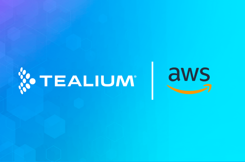 Learn more